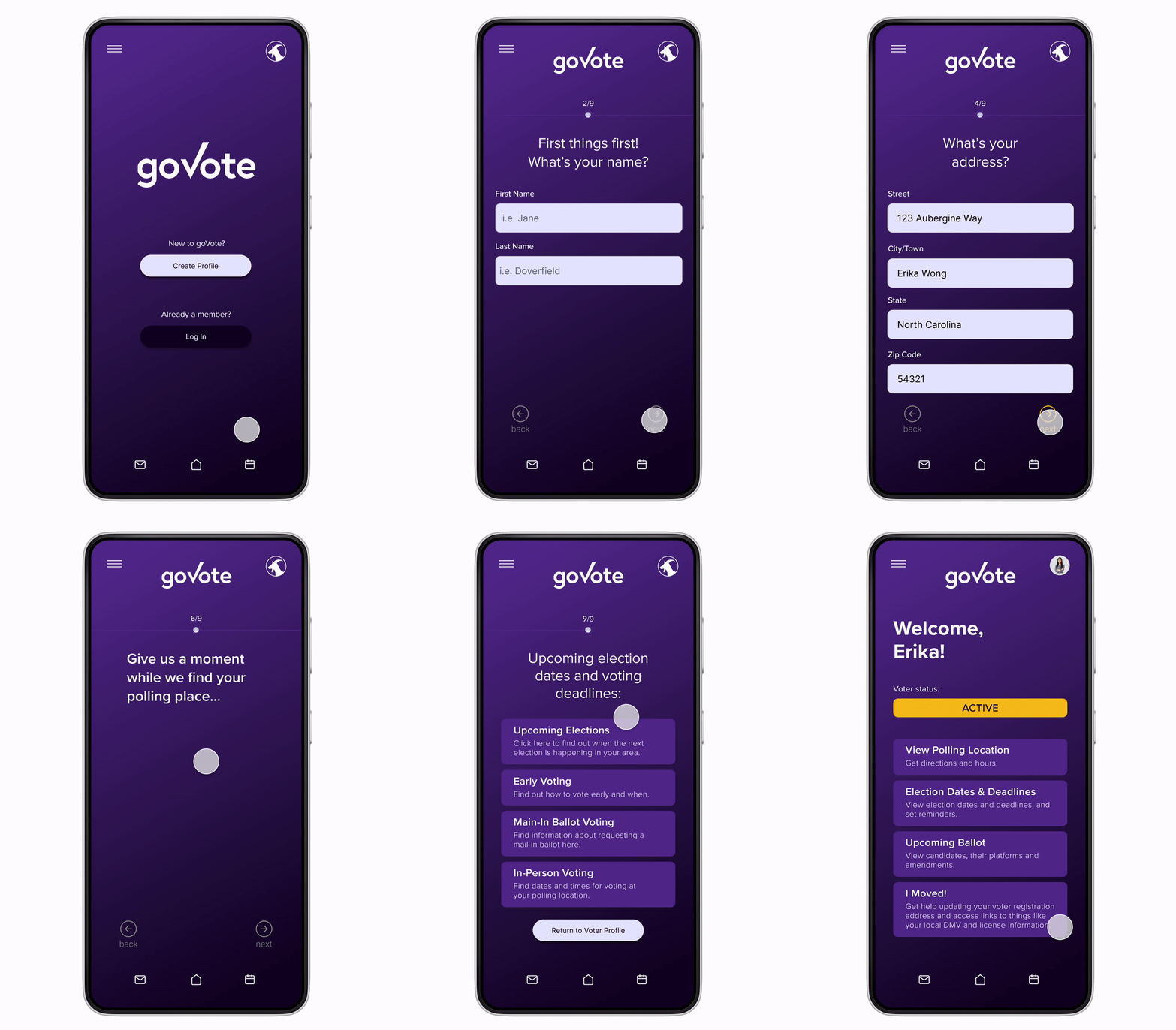
GoVote Concept
Voter App Case Study
Project Type:
1 week concept hackathon
Date:
Nov. 7, 2022–Nov. 14, 2022
Team Members:
4 UX Designers
Role:
Lead UX/UI/Visual Designer
Tools:
Figma, Maze, Notion
Introduction
The 2020 election had a record breaking voter turnout, but even that was only 67% of US voters. For something so pivotal, those numbers can be improved. 100% is impossible, but we can do better. So why did 33% of Americans stay home on voting day? Well, for starters, not everyone knows where to go to vote, or where to go to find out. They might not know if they’re even registered to vote, let alone how to do so in time for a fast approaching election. As it pertains to local elections, many people don’t know their running candidates, or what bills they’ll be voting on.
US voters have to visit a number of different sites to find all of this information–most of them being government sites that are difficult to navigate. Having to find all this information on top of an already busy schedule can be stressful, and it’s no surprise some Americans choose to forego their voting rights. So how might we create a user friendly platform that provides all of this crucial information all in one easily accessible location?
The Challenge
Voters need a single source of information such as registration status, polling locations, and candidate platform info to feel more confident in the US voting process.
My Role
I led in the sketching, ideation and UI/visual development of the application as well as assisted in conducting user interviews.
Our Solution /
Final Prototype
The Research
Since my team and I were operating under a tight timeline, we were only able to dedicate two days to the research to inform our ideation.
In addition, I performed a surface level comparative analysis, using TurboTax as a comparator, citing their informal UX writing style and user progress tracking elements as inspiration on how to add elements of usability to ease a stressful and sometimes confusing process.
We conducted seven
user interviews:
“I plan on voting every time I am eligible to anyways, and I am already registered to vote, but I would like to see some basic information on voting and the candidates.”
After the interviews, we synthesized the data with affinity mapping, with the goal of pulling our greatest insights to direct our ideation process.
We pulled the following 3 main insights:
- Voters want easy access to important registration info and current voter status
- Voters want objective information on candidates and what’s on their ballot
- Voters want easy access to information regarding their polling place, such as current wait times on voting day and parking.
Creating a
User Persona
After synthesizing the research we compiled, our user persona took shape in the form of Erika. Creating personas help us to keep the user in mind as we work to create a solution.
Search results often lead to sites that are difficult to navigate or offer biased info
Often times there are policies on ballots she’s uninformed on
Frustrations:
Easily access voter registration status
Easily locate her nearest voting location
Be informed of candidates and ballot subject matter
Receive reminders for upcoming elections
Goals & Needs:
Enter Sketching
& Ideation
We focused on creating 3 main features for the app:
1.
Quick Signup
Easy and intuitive onboarding with important info included
2.
Registration
Current registration status and how to get registered
3.
Polling Location
Info on polling location, wait times and parking
Wireframing &
Lo-fi User Testing
10 Usability Testers: Metrics
Would you use this app?
The Final Prototype:
UI & Visual Design
Why purple?
What do you get when you mix America’s red right and blue left? You get Purple. I decided to choose a neutral color as not to potentially show any bias towards the left or right…and what’s more neutral than the merging of those two?
I created a logo and slogan for our hackathon GoVote App, along with a color palette to inform the design of the platform.
Next Steps
Fill out Ballot information user flow
Add section for transportation services
Flush out upcoming election notifications
Reflections
Considering the week long timeframe my team and I had to work with, I’m extremely pleased with the end result. We accomplished a lot and were able to pull together a nice looking and useful application addressing a relevant issue here in the US.
As pleased as we were with the end result, we did have a fairly rocky start as a team. It was our responsibility to choose our own hackathon project together and there was some disagreement. As a result, time was not used as efficiently as it could have been, but with enough discussion, patience and trust, we were able to move past this and begin working seamlessly and collaboratively.


