
Trip Itinerary
Case Study

Introduction
Planning a trip is stressful. There’s so much to think about and so many pieces to keep track of and the only thing that makes traveling both more and less enjoyable at the same time, is planning a trip with others. Most of us prefer traveling with friends and family rather than alone, but on the flip side, the more people you plan a trip with, the more complicated and overwhelming it gets.
Suddenly, instead of just taking your own tastes into account, you’re factoring in the dietary restrictions, age, preferences, and perhaps disabilities of maybe numerous other people. Where should we eat? Where should we stay? Should we go ziplining, or is anyone afraid of heights? The answer to these questions is ample collaborative planning and sharing.
Keeping track of all these moving parts certainly isn’t without its challenges and often times having to consider all this is just too much for most people, perhaps making them less inclined to go on trips at all. So how might we keep trip planning between numerous travelers from getting too overwhelming?
Project Type:
two week design sprint
Date:
Oct. 10, 2022-Oct. 21, 2022
Team Members:
3 UX Designers
Tools:
Figma, Maze, Notion
The Challenge
Users need a better way to plan trips, create itineraries and access their trip information on the go. As most trips are not planned in a bubble, they also need a way of sharing these plans and collaborating with friends and family. More than anything though, they need a way of doing this all in one place.
My Role
As the scrum master for my capstone design team, I narrowed the group’s focus on the achievable goals in order to ensure the prototype completion within the two week timeframe. I was involved in the entire process, from research and synthesizing to sketching, ideation, prototyping, user testing and iteration.
The Research
Competitive Analysis
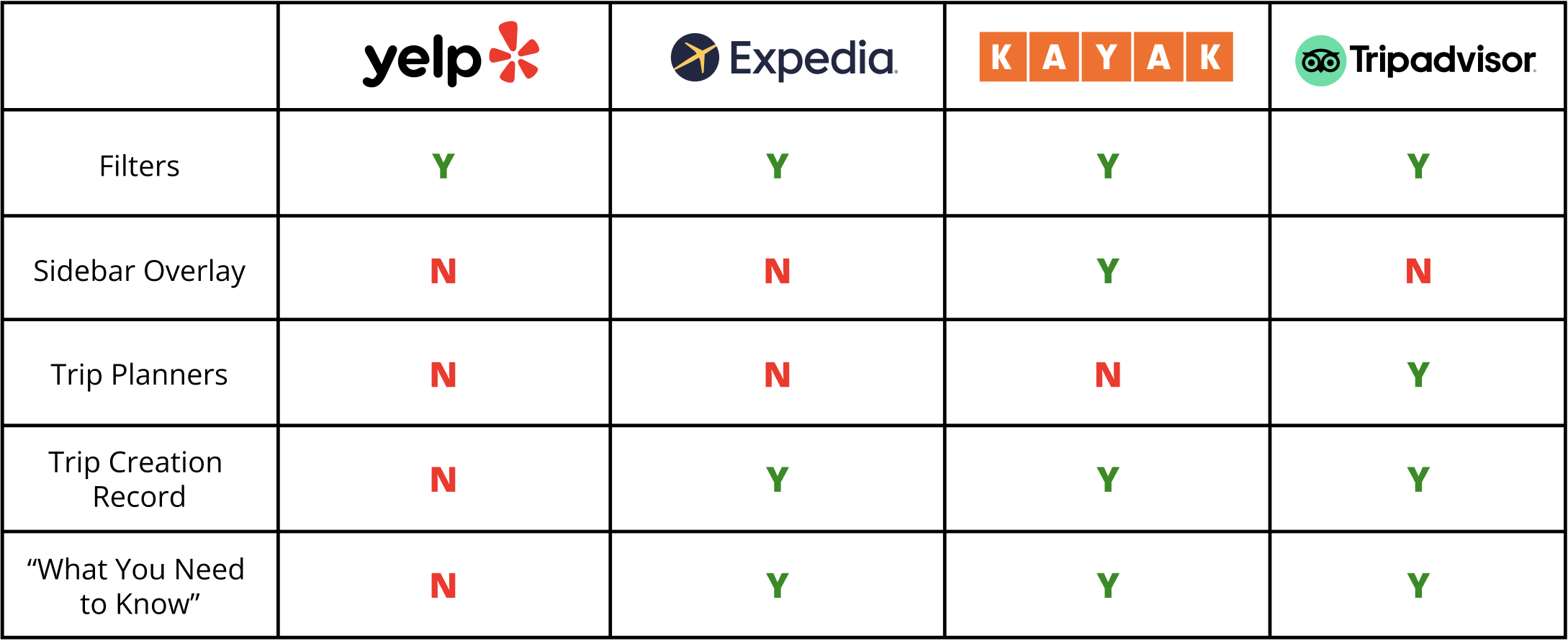
To generate a better understanding of the travel site industry, we first decided to conduct both a competitive and comparative analysis, examining features we deemed to be especially beneficial to users.

Comparative Analysis
Features such as maps with location pinpointing, social media sharing components and Trip creation records particularly peaked our interests to be utilized in Yelp’s trip itinerary feature.
User Surveys & Interviews
After conducting 5 user interviews, we organized our insights into groups identifying patterns in user preference and behavior.
The next step was to conduct user surveys, and after receiving 26 responses, we pulled the following insights:
The majority of our survey takers ranged from 24-30 years old
They plan to travel at least 4 times per year
They prefer a full service travel site when planning a trip
They often refer to a map when planning their itineraries
And they prefer to share travel plans with their fellow planners

User interview Key Insights:
“I like gathering all my travel research into one place (Google Docs) where I can share the info with others and they can contribute to the doc as well.”— User Interviewee“I don’t plan hour by hour. I only plan the most exciting places and everything else…we play it by ear.”— User Interviewee“The most important thing when organizing a trip is figuring out realistically how many places we can visit/things we can do in a day.”— User IntervieweeSo, What Did We Do Next?
We collected all this info, from our surveys and interviews by further synthesizing it into a user persona. This step helped us to better wrap our heads around exactly who our users are.
Meet Mari
Mari is a 27-year-old saleswoman that enjoys traveling for work and for pleasure–usually around 2-4 times per year. Mari needs a better way to plan trips, create itineraries and access her trip information all in one place. In addition, she needs a way to share these plans and collaborate with her friends and fellow travelers.
Enter Sketching
& Ideation…
Finally once we finished collecting all the necessary info and making sense of the research, it was time to start sketching and ideating potential solutions to our users’ needs.

Our Solution
After finishing our sketches and determining our game plan, we began prototyping, bringing our ideas to life. This is what we came up with.
Let’s Break it Down…
…Step by Step
A Call to Action
When a site as large, and with as much depth as Yelp launches a new feature, it’s important to let users know not only that it’s available, but what it is and how to use it. We decided the best way to do this was by designing a vacay-centric banner image with a call to action and “Plan Your Trip” button.

Creating an Itinerary
We learned that when users are planning a trip, people like to schedule a couple major activities per day, and then leave the rest of their day open and loosely planned. From this information we designed the “Yelp Me Plan My Trip” feature which suggests activities/events/restaurants based on the user’s already scheduled plans, siting location, interests and ratings as the source of these recommendations.

Sharing & Collaborating
Since research showed most of our users travel in groups, we designed a feature that allows users to share their itinerary and collaborate with others.

Keeping a Record
One of Mari’s needs was to be able to record a record of her trips, so she can go back and access them anytime.

User Testing & Results
We conducted two rounds of user testing; one for the initial prototype and another round after iteration. We asked users to complete a series of tasks and had them rank how easily they were able to complete them on a scale of 1 to 5 (1 being difficult and 5 being easy). The results were promising; the ease in which users completed the tasks increased significantly across all four tasks.


Next Steps?
Further build out itinerary feature, making flight, hotel and transport services available to add
Further build out sharing/collaborating features for group travel planning
Reflections
This project presented my team with a very complex problem, to which we responded with an elegant solution. Our greatest difficulty fell within the realm of effectively maximizing screen space. With users needing a single location to create their trip itineraries, how do you provide them with nearly unlimited browsing of restaurants/activities, offer a way to schedule these selected events, all while simultaneously displaying their mapped locations on one screen? This was our challenge and my fellow designers, myself and our users were all pleased with the proposed solution, supported by high rates of usability and task completion success; these scores were further improved upon with minor iteration, made in response to user testing feedback.