Conceptual Album Designs for Indie Pop band:
In September of 2010, LA based indie pop band, Foster the People released their first hit single, “Pumped Up Kicks.” This song landed them on the map and brought a lot of attention to the indie music genre as a whole. It was all over the radio, appealing to many groups with its catchy tune and unique vocal stylings.

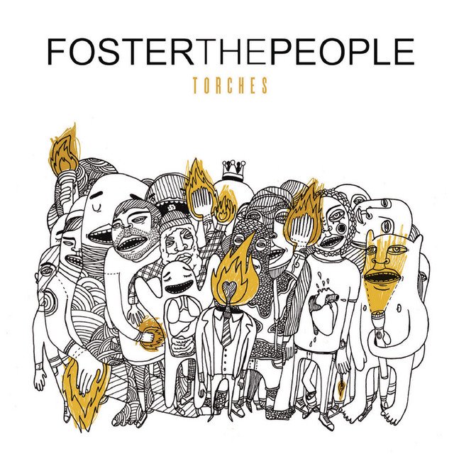
In the following year, they released their very first album, “Torches,” with their hit single. They quickly became my favorite band and I went to see them in concert at the Boston House of Blues in May of 2014. Not only a huge fan of their music, I was a big fan of their album art too. I felt inspired to try my hand at something similar, but with my own minimalist flare.

Final Designs


Tools/methods:
Sketching, Adobe Illustrator image trace & pen tool
The Process: Concept 1


These sketches were largely inspired by lead singer Mark Foster’s unique vocals. He has a fairly wide vocal range reaching notes somewhat reminiscent of the Bee Gees–something you don’t hear much these days; I wanted my album cover design to communicate that. I wanted the face and words leaving its mouth to breath something different–something that indicated this album stands out from the others on the shelf.
The Process: Concept 2


This concept was largely inspired by classic band tees. I wanted to make a design that was squarely contained, like you see to the left–something you could easily envision on a tee shirt. Much like concept 1, I went with hand drawn type as a way of communicating the band’s unique sound (a one of a kind typeface for a one of a kind band).
The Process: Concept 3


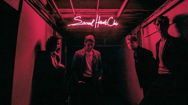
While “Torches” was a real album, “Neon Lights” is my own concept. This one mostly speaks for itself. Much like the old wall mounted neon light signs you see in bars, this album was designed to look like just that. Interestingly enough, their third album, “Sacred Hearts Club” later released in 2017 utilized neon lights on the cover (below).

