As with most things, there’s a story behind this.
Here’s How it Started . . .
I walked into the kitchen and handed my dad my new business card. He flipped to the back immediately.
Dad:
“Your information is upside down!”
Me:
“No, it’s supposed to be like that, so my information is right side up when they flip it.”
Dad:
“That’s not how people flip their cards”
Me:
“Well that’s how I flip mine…”
Me:
“Maybe I’ll ask around and see what the consensus is on card flipping...”
Designers should approach a design challenge from multiple angles.
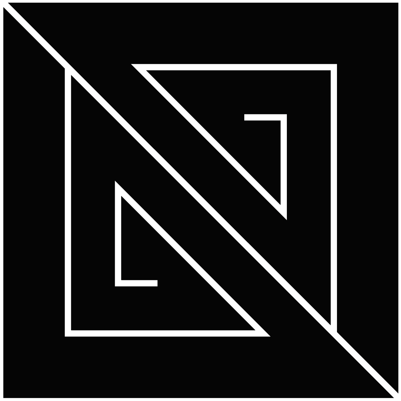
I wanted my logo and business card to reflect that through its flippability.
UXing My Monogram
figure c.
figure a.
figure b.
When I first designed my business card (using figure a.), I was certain people viewed the other side by flipping top to bottom. My plan was to ensure my information would be right-side-up when people flipped the card, but after asking around, there seemed to be an even split of card flippers–those that flipped their card top to bottom, and those that flipped side to side with their wrist. I realized that to design a card for the two kinds of flippers, I’d need to modify my monogram (figure c.) so no matter how they flipped the card, my information on the back would always be right-side-up.
Monogram Evolution
I further modified the monogram with the goal of better guiding the eye. I created two versions for versatility of use (shown far right).
The Functionality
I boxed in the monogram and extended the diagonal, guiding the eye from “design” to “design,” further expanding on the theme that a design solution can only be achieved by approaching the challenge from multiple angles.
Referencing Taoist Philosophy, one section is grey while the other is white, acting as a subtle ode to the yin and yang, emphasizing the need for balance in both life and design.


