Travelers Marketing In-House Rebrand
Project Type:
In-house Rebrand
Role:
Graphic Designer
Date:
2017-2022
Team Members:
None
Introduction
Travelers Marketing is a small marketing firm established in 1998 presently based in Natick, Massachusetts. They specialize in B2B marketing in the form of OOH advertising and public/private sponsorships. When I first joined the company in late 2015, they lacked a consistent brand image and guidelines. Shortly after my arrival, I suggested I create a cohesive brand identity for the company, and after another year or two of convincing, I was given the green light to proceed.
My vision for the brand was to create something clean, modern, and sophisticated yet approachable. Initially I thought this was something I could complete over the course of a number of months, but in reality, it took me roughly five years when added to my existing role and responsibilities with the company. This was an ambitious first major project for a young designer, but ultimately, the rebrand was a success; I provided the company with an entirely new logo and brand guidelines, business cards, letterheads, media kits, proposals and promotional collateral.
It Started with the Logo
Old Logo & Business Card:
I started this whole process by focusing on the logo first as it would inform the company’s new brand identity. I assessed the initial logo to be unbalanced and dated. It’s shape presented alignment difficulties and the color palette felt juvenile. While I wanted to update the Franklin Gothic typeface as well, but this was something the company’s managing partners were unwilling to consider. They wanted the new logo to be reminiscent of the initial version as not to become unrecognizable.
Generating Buy In
Being the only creative in the company, I knew I would have to start this process by generating buy in and trust from the non-creatives and key stakeholders. My approach to this was rooted in education–providing these key decision makers with an intro to basic design concepts.
I started with color theory. I Provided examples of logos that seemed to follow this train of thought to provide them with a frame of reference prior to showing my concepts.
The Development & Evolution
of a Logo
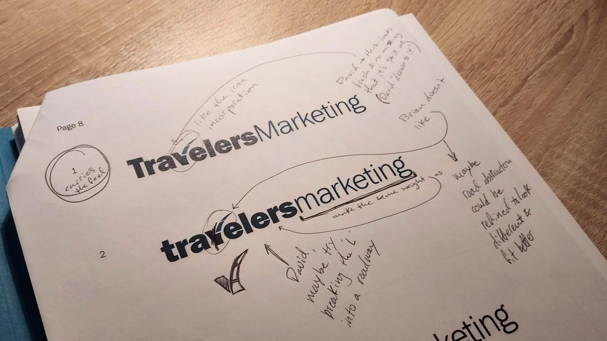
The key stakeholders asked to be involved throughout the course of the entire process. I conducted seven total meetings with the managing partners and VP of Marketing in which I presented the results of several concepts (both mine and theirs). They had a number ideas they wanted me to test, but ultimately, my concept shown below (upper left corner) is what continued to evolve over the course of six meetings until I presented the final concept in the seventh meeting. As your eyes travel through the photos below from left to right, you will see the subtle evolution of various characteristics including the roadmark, it’s merging with the letter “v,” type weight and color
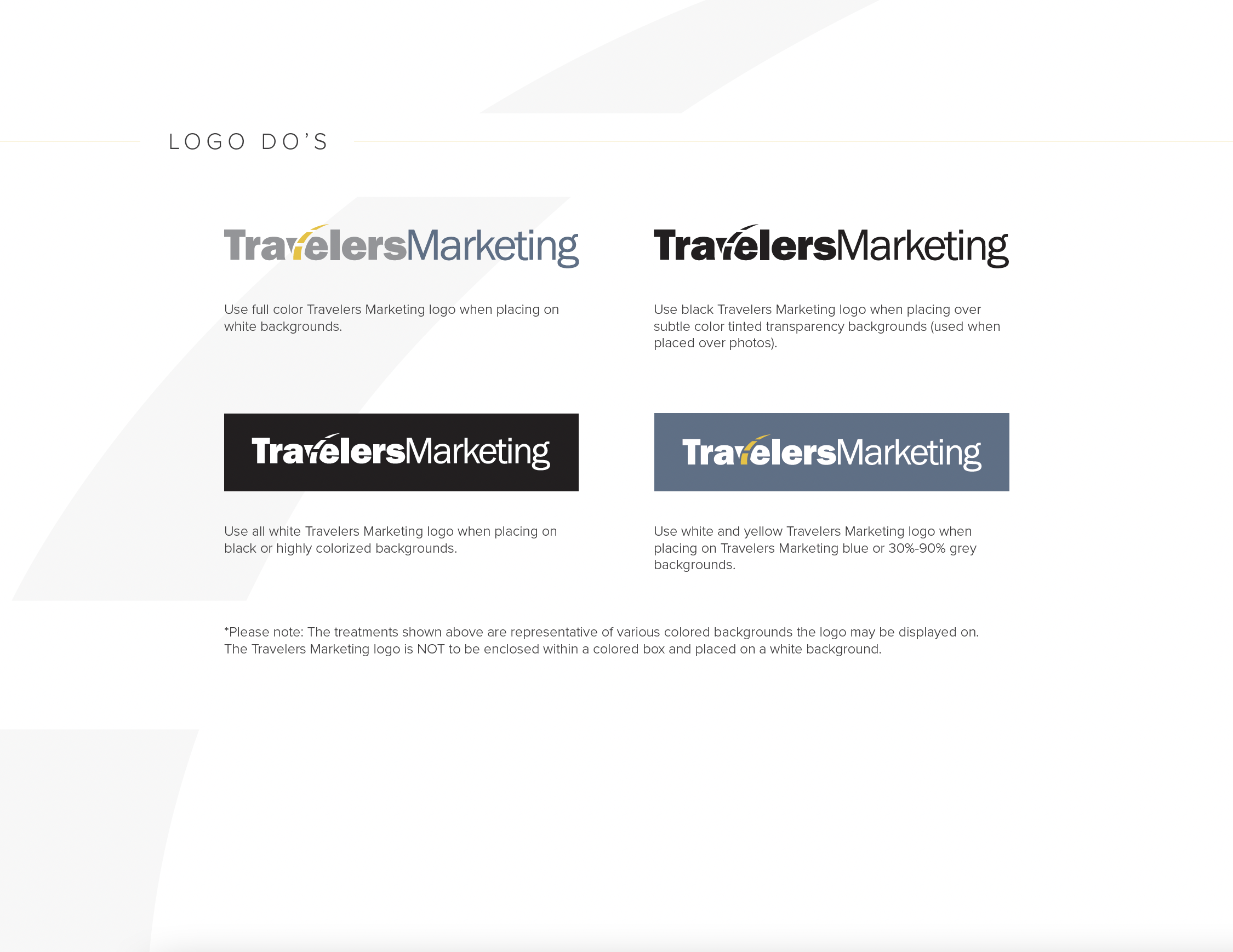
New Logo

Brand Elements
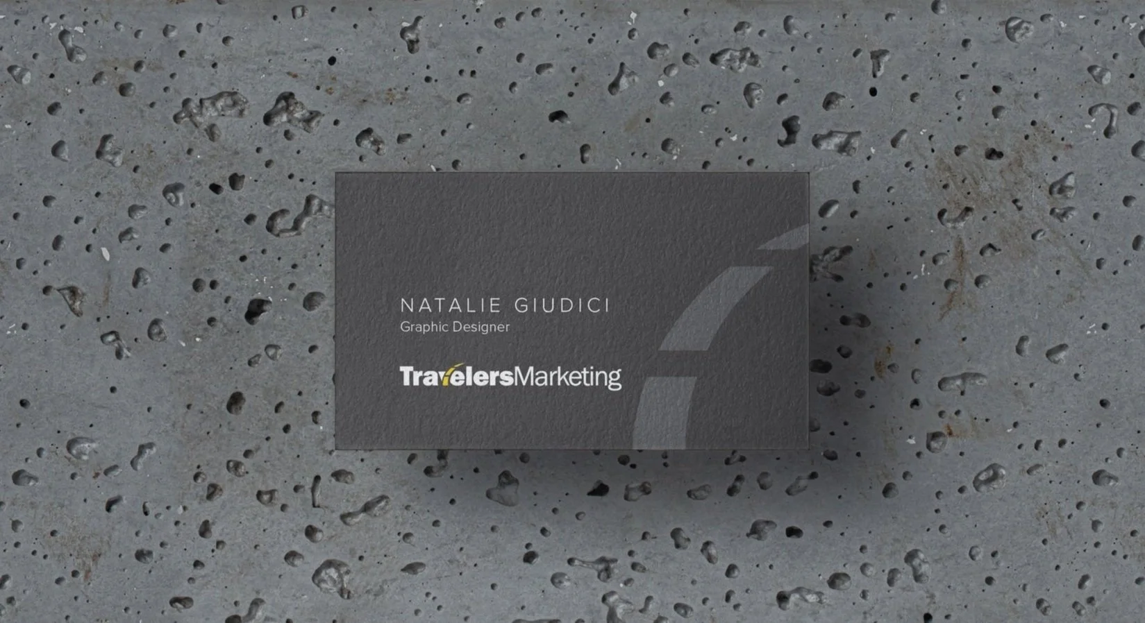
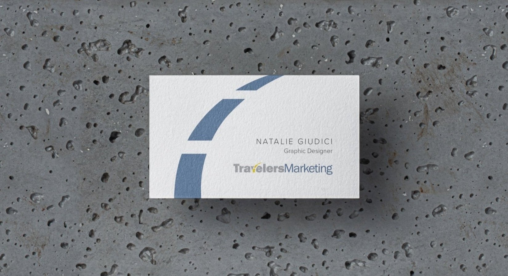
New Logo & Business Cards
Color Palette
Typefaces
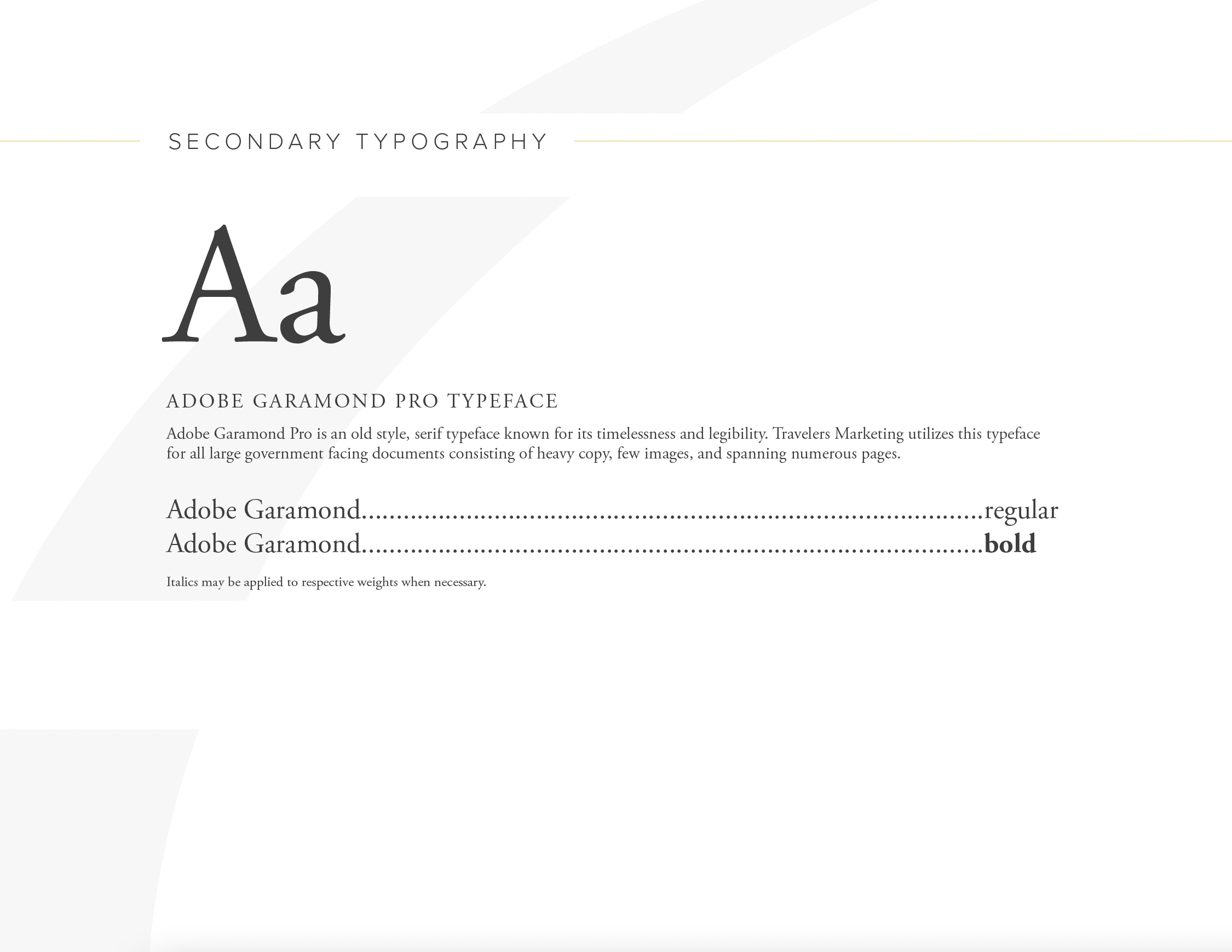
As a crucial part of the rebrand, I implemented Proxima Nova and Adobe Garamond as the company’s two official typefaces.
Proxima Nova provides a clean, minimalist, modern feel to the brand. It’s quite versatile, lending itself well to short body copy and display headers.
Adobe Garamond carries a classic, timeless feel and aids in legibility for larger bodies of text.
Employee Headshots
As part of the rebrand, I provided Travelers Marketing with employee headshots. The company lacked this previously and with much of the modern business environment taking place virtually, I thought this would be a tremendous way to make a solid first impression. I took the photos with my Canon Rebel and edited each one in Adobe Photoshop.


